
Your office color scheme is the foundation of a workspace that actually works for you. Whether you’re painting a dedicated home office, updating a corner of your bedroom, or redesigning your entire work environment, the colors you choose will influence your focus, mood, and productivity every single day. The good news? You don’t need an interior designer’s budget or a fancy degree to get it right. This guide walks you through how color affects your mental state, which palettes work best for different needs, and how to carry out changes without overwhelming your space or your wallet.
Table of Contents
ToggleKey Takeaways
- Office color schemes directly impact productivity and focus—blues and greens calm the mind and encourage concentration, while reds and oranges can energize but risk overstimulation.
- Research shows properly chosen office colors improve work output by 10–15% and reduce eye strain, making color psychology a practical investment in workspace performance.
- Use the 60-30-10 design rule to balance color: 60% dominant color (like soft sage), 30% secondary (warm white trim), and 10% accent (deep charcoal) to avoid visual fatigue.
- Test paint colors on full wall sections under actual lighting conditions for 3–5 days before committing, since morning, afternoon, and artificial light all shift how a color reads.
- Implement accent colors through small, flexible elements like desk accessories, artwork, and throw pillows rather than large painted walls, allowing you to update your office color scheme seasonally without major overhauls.
- Avoid pure white walls in offices—choose off-whites with warm or cool undertones instead to minimize harsh light reflection and eye fatigue during long screen work.
How Color Impacts Productivity and Mental Well-Being
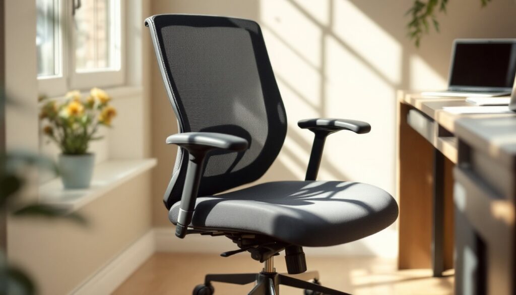
Color isn’t just decoration, it’s psychology in action. Your brain responds to hues in measurable ways. Blues and greens calm the nervous system and encourage focus, which is why they’re popular in offices where concentration matters. Reds and oranges energize but can overstimulate in long doses. Yellows boost mood and creativity but feel grating on walls in large quantities. Grays and neutrals provide visual rest and stability, letting you concentrate on work rather than your surroundings.
Research consistently shows that properly chosen office colors reduce eye strain, decrease mental fatigue, and can improve work output by 10–15%. The key is matching color psychology to your actual work. If you’re doing detailed, focus-heavy tasks (coding, writing, accounting), cooler tones or soft neutrals work best. If you need creative momentum or client-facing energy, warmer accents strategically placed can lift your environment without distraction.
Choosing the Right Base Color Palette
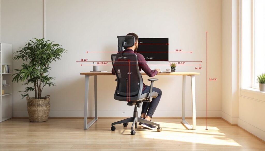
Your base color, the wall color that dominates your office, sets the mood for everything else. Don’t pick based on what looks good in a paint chip alone: test it on a full wall section under the lighting you actually work in. Morning light, afternoon light, and artificial light will all shift how a color reads.
Neutral and Warm Tones
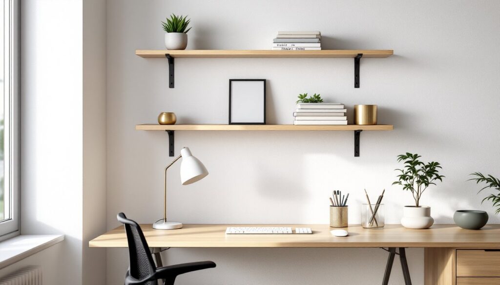
Neutrals like soft whites, warm grays, and pale beige create a clean, professional backdrop that lets you focus on work without visual noise. They’re forgiving if you change accents later, and they work in rooms with any light exposure. Warm undertones (creams, light taupes) feel inviting without being distracting. A common mistake: choosing pure white, which reflects light harshly and causes eye fatigue during long screen work. Instead, reach for off-whites with slight warm or cool undertones.
Cool Blues and Greens
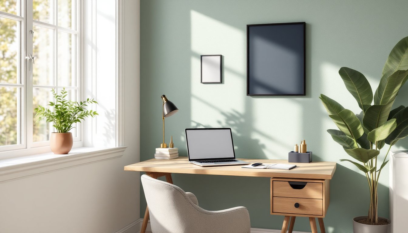
Soft blues, think pale sky or slate tones, encourage calm and concentration. They’re excellent for high-stress work but can feel cold if the room doesn’t have sufficient natural light. Greens, particularly muted sage or soft forest shades, are the all-purpose office hero. They feel natural, reduce eye strain when paired with screen work, and work equally well for focus-intensive tasks or creative projects. Neither requires heavy accents to feel complete: they’re stable enough as standalone base colors.
Popular Office Color Schemes for Every Style
The 60-30-10 rule, a design principle that assigns 60% dominant color, 30% secondary, and 10% accent, translates perfectly to office design. A soft sage base (60%), paired with warm white trim and shelving (30%), and touches of deep charcoal or muted brass accents (10%), creates a professional yet inviting space. This ratio prevents any single color from dominating so heavily that it becomes fatiguing.
Monochromatic schemes (varying shades of one color family) offer another straightforward approach. Light gray walls, medium gray furniture, and charcoal accents create visual depth without the complexity of managing multiple colors. This works especially well in smaller offices where too many hues make the space feel cramped.
Two-tone walls, pairing a neutral base with a slightly warmer or cooler accent wall behind your desk, can define your work zone without demanding full-room repainting. This strategy is popular among remote workers who want a professional video-call background without the commitment of painting three walls. Interior design inspiration sites like Home Bunch showcase dozens of real-world applications that you can adapt to your space and budget.
Implementing Accent Colors Without Overwhelming the Space
Accent colors add personality and visual interest, but they’re easy to overuse in a tight office. The safer path: use accents in smaller elements like desk accessories, a single bookshelf, framed artwork, or a throw pillow rather than large wall areas. If you want an accent wall, keep the color muted and place it where you won’t stare at it during focused work, typically behind furniture or to the side of your main desk.
Warm accents (terracotta, burnt orange, warm gold) pair best with neutral and cool bases, adding energy without chaos. Cool accents (deep teal, navy, muted plum) work with warmer bases to add sophistication. The key is saturation: highly saturated accent colors are visually louder and faster to tire your eyes. Muted, slightly desaturated versions of whatever accent appeals to you will feel intentional rather than chaotic.
Texture and material matter too. A terracotta-colored ceramic planter isn’t as intense as a terracotta accent wall. A navy-bound journal or deep blue wall art provides accent color without the commitment or visual weight of paint. This is where budget-friendly updates shine, swap out throw pillows, change artwork, add plants in colored pots, or refresh desk organizers to shift your accent color palette seasonally or whenever you need a change.
Practical Tips for Testing and Updating Your Office Colors
Before painting, buy sample-size paint cans in your top three contenders and paint large swatches (at least 2 feet × 2 feet) on different walls of your office. Live with these samples for 3–5 days, observing them in morning light, afternoon light, and artificial light. You’ll quickly see which feels right and which drains energy from the room.
When you’re ready to paint, prep is non-negotiable. Fill holes, sand glossy surfaces, and prime if you’re covering a dark color or making a dramatic shift. A quality primer ensures color accuracy and saves money in the long run by reducing the coats of paint you’ll need. Use a semi-gloss or satin finish on trim and doors (easier to clean and more durable), and eggshell or matte finish on walls (hides imperfections and reduces glare from screens).
If painting feels like a bigger project than you want to tackle, you have options. Peel-and-stick wallpaper in solid colors or subtle patterns is a legitimate temporary upgrade. Removable wallpaper is especially practical in rental offices. Furniture rearrangement and the addition of colorful storage units, a fresh rug, or curtains in your chosen accent hues can shift the entire feel of your space without touching a paintbrush. Many DIYers find that layering color through furnishings rather than walls gives them flexibility, something valuable if your work setup tends to evolve. Young House Love offers budget-friendly room makeover tutorials that show how dramatically a space can shift with paint and strategic swaps. The 60-30-10 color rule formalizes what many successful office redesigns instinctively follow: balance and intention in color choice.