
Choosing the right paint color for your home office isn’t just about aesthetics, it’s a strategic decision that affects how you work every single day. The color on your walls influences focus, mood, energy levels, and even how alert your brain feels during long work sessions. Whether you’re setting up a dedicated office space for the first time or refreshing a tired workspace, the right paint color can be the difference between a room that energizes you and one that drains you. This guide walks you through the best paint colors for office productivity in 2026, covering cool tones, warm tones, neutrals, and bold accent strategies so you can make a choice backed by both science and practical know-how.
Table of Contents
ToggleKey Takeaways
- Paint color for office spaces directly impacts focus, mood, and productivity through biological and psychological pathways that influence your work performance.
- Cool tones like blues and greens reduce eye strain and support sustained concentration, making them ideal for analytical and detail-oriented tasks.
- Warm tones including soft yellows and terracotta energize creative work and boost dopamine production, perfect for collaborative or problem-solving environments.
- Neutral paint colors such as soft grays, warm whites, and taupe offer timeless flexibility, allowing you to refresh accents without repainting your office.
- Always test paint samples on multiple walls at different times of day, use quality eggshell or soft satin finishes, and prioritize proper prep work and appropriate lighting for a professional result.
- Accent walls or color-blocking strategies let you add visual interest and sophistication to your office without overwhelming your workspace or compromising focus.
Why Paint Color Matters For Office Productivity And Focus
Your office walls do more than fill space, they actively shape your mental state and work performance. Research consistently shows that certain colors reduce eye strain, lower stress hormones, and improve concentration, while others can distract or fatigue you over the course of an eight-hour workday.
The brain responds to color through both biological and psychological pathways. Cool colors like blues and greens activate the parasympathetic nervous system, which calms you down and supports sustained focus. Warm colors like reds and oranges trigger the sympathetic nervous system, increasing energy and alertness, useful for creative work but potentially draining for detail-oriented tasks. Neutrals provide a blank canvas that doesn’t trigger strong emotional responses, making them ideal if you’re uncertain or if your office doubles as a guest space.
Beyond mood and energy, paint color also affects lighting perception. Light colors reflect more natural and artificial light, reducing eye fatigue in dim rooms. Darker colors absorb light and can create coziness but may require extra task lighting to avoid strain.
The finish matters too. Matte and eggshell finishes minimize glare and reflections, critical if you spend hours staring at screens. Semi-gloss finishes are easier to wipe down but bounce light and can feel clinical in an office setting. For most home offices, an eggshell or soft satin finish strikes the right balance: low sheen, easy to maintain, and kind to your eyes.
Cool Tones For Concentration And Calm
If your office work demands deep focus, writing, analysis, coding, or detailed design work, cool tones are your allies. Blues, greens, and blue-grays create a sense of calm and quiet that supports sustained concentration over hours.
Blue is the heavyweight champion of focus colors. Light to medium blues (think pale sky or soft denim) don’t feel cold: they feel clear and open. They reduce mental clutter and lower heart rate, which is why so many corporate offices lean on blue. Avoid very dark blues or navy unless you have ample natural light: they can feel cave-like and heavy. Popular options include soft powder blues, dusty periwinkles, and slate blues. Pair them with white or light oak trim for contrast so the room doesn’t feel monotonous.
Green (especially soft sage, celadon, or soft eucalyptus) combines the calming properties of blue with a natural, grounding feel. Green reduces eye strain and connects psychologically to nature and renewal, useful if you’re feeling burned out. It works beautifully in rooms with natural light and pairs well with plants and wood furniture.
Gray-blue tones (like Benjamin Moore’s Palladian Blue or Sherwin-Williams’ Sea Salt) give you cool benefits with a more neutral backdrop. They’re less “commitment-heavy” than pure color and work as a sophisticated, timeless choice that won’t feel trendy in a few years.
With cool tones, layer in warm-toned lighting and wood furniture to prevent the space from feeling sterile. A warm-white LED bulb (2700K-3000K) softens the psychological effect of cool walls.
Warm Tones For Energy And Creativity
If your work is creative, collaborative, or requires bursts of problem-solving energy, warm tones can unlock that mentality. Warm colors stimulate the brain and increase dopamine production, the neurotransmitter tied to motivation and pleasure.
Soft yellows and warm beiges (like butter cream, pale honey, or warm sand) energize without overwhelming. They feel welcoming and slightly optimistic, which helps if you’re freelancing or running a creative business from home. Avoid neon or artificial yellows: they’re harsh on the eyes. Muted, warm yellows work better. These colors pair naturally with plants, natural wood, and soft whites.
Warm grays and greiges (gray-beige blends) give you the psychological warmth of brown tones without the weight of true brown. They’re sophisticated, forgiving (they hide dust and fingerprints better than cool colors), and work in rooms with variable lighting.
Soft terracotta or peachy tones have made a comeback and offer a subtly warm vibe that feels less corporate than yellow but more energetic than beige. They work especially well if your office has western or afternoon sun exposure.
Warm colors work best in rooms with good task lighting. Pair them with cooler accents (a blue throw, cool-toned art) to balance the stimulation so you don’t feel overstimulated by day’s end. A home office style that blends warm paint with cool accessories creates the best of both worlds.
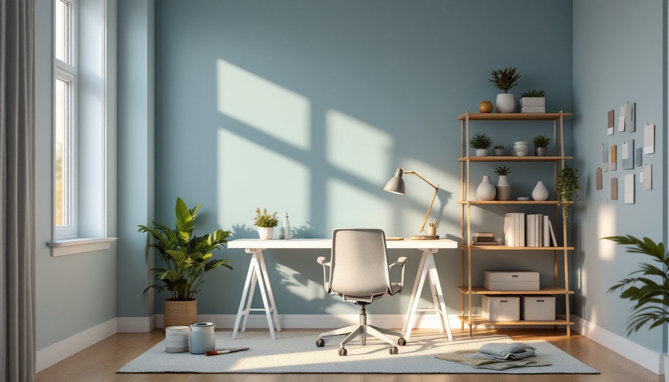
Neutral Palettes For Versatility And Timelessness
Neutral paint colors are the safe choice for a reason: they work, they age well, and they let you change accents and accessories without repainting.
True whites and off-whites (like Benjamin Moore’s Simply White or Sherwin-Williams’ Alabaster) create a clean, minimal backdrop. They maximize light reflection, making small or dim rooms feel larger. But, pure white can feel sterile without the right furnishings, and it shows dirt and smudges more readily. Off-whites with a hint of warmth (cream, ivory, or warm white) soften the effect without losing brightness.
Soft grays in light to medium tones are the go-to neutral for 2026. They’re contemporary without being trendy, they complement almost any furniture style, and they don’t feel cold or institutional when chosen correctly. Look for grays with slight undertones, warm grays lean slightly brown, cool grays lean toward blue. A warm gray pairs better with wood and warm metals: a cool gray suits modern, minimalist spaces.
Taupe and warm greige blend gray, beige, and brown undertones. They’re chameleon-like: they adapt to your lighting and furnishings and feel instantly mature and sophisticated. Taupe works particularly well if you have both natural and artificial lighting that shifts throughout the day.
The advantage of neutrals is flexibility. You can change your desk, chair, wall art, and lighting without the wall color fighting your choices. This matters if you’re renting, if you like to refresh your space frequently, or if you’re unsure about committing to color. Neutrals are also safer if your office is a small desk workspace that needs to feel open and uncluttered.
Accent Walls And Bold Color Strategies
If solid color feels safe but boring, an accent wall, painting one wall a deeper or bolder hue while keeping the rest neutral, gives you visual interest without overwhelming your senses.
How to use an accent wall: Paint the wall behind your desk or the one you face most while working. This draws focus without dominating the entire room. A deep forest green, navy, or charcoal gray works beautifully as an accent. Avoid hot pinks, bright oranges, or electric purples unless your work thrives on constant stimulation: they’re fatiguing over time.
Color blocking is another strategy: divide walls into two colors separated by a horizontal stripe. For example, warm white on top and soft blue-gray below, with a chair rail or paint line at about 36 inches high. This breaks up wall space and makes the room feel designed, not accidental. It also reduces glare from above while keeping walls below eye level calmer.
Bold trim and architectural details let you add color without committing entire walls. Paint your baseboards, crown molding, or door frames a deeper shade than your walls (like charcoal or navy trim on pale walls). This adds sophistication and frames the space without the intensity of a full accent wall.
When using bold colors, ensure your room has enough natural light and supplemental task lighting. Bold, dark colors need light to avoid feeling oppressive. Also, consider hiring a professional painter for accent work, crisp, clean lines between colors are harder to achieve than they look.
Practical Tips For Choosing And Applying Office Paint
Before you buy a gallon, test your color choice properly.
Get large paint samples. Buy sample sizes and paint 2×2-foot swatches on at least two walls (if possible, one that gets natural light and one that doesn’t). View them at different times of day. That perfect blue might look purple at sunset or dingy at noon. Let samples cure for 24-48 hours: paint changes slightly as it dries. This step saves hundreds in regret paint purchases.
Check undertones against your existing elements. Hold paint chips next to your flooring, existing furniture, and trim. If you have warm-toned oak floors, a cool-gray paint will clash unless you’re deliberately playing those contrasts. If your office is small, lighter tones (around 50% or lower on the lightness scale) make the space feel roomier. Darker tones work in larger rooms with abundant light.
Prep work is non-negotiable. Fill holes with spackle, sand smooth, and prime bare drywall. Skip this and your finish will be blotchy and thin. For smooth, professional results: clean walls thoroughly, caulk gaps where walls meet trim, use painter’s tape on trim and edges, and lay a drop cloth (canvas works better than plastic, it won’t slip).
Use quality paint in the right finish. Budget paint saves money upfront but requires more coats and doesn’t hide imperfections. For office work, invest in a mid-range to quality eggshell or soft satin finish from a reputable brand. One gallon covers roughly 300-400 square feet depending on texture and color. Two coats are standard for good coverage.
Lighting is critical to your final perception. The color you see in the paint store under fluorescent lights will look different in your office under natural light and warm LEDs. Interior design inspiration from sources like House Beautiful can help, but remember their photos are styled and professionally lit. Your space will look different, and that’s okay, work with it by adjusting furnishings and lighting to complement your walls.
Consider sheen carefully. Matte finishes hide wall imperfections but are harder to clean. Eggshell is the sweet spot: subtle sheen, cleanable, and low-glare. High-gloss is rarely right for office walls unless you’re painting trim or built-ins.
If your office has imperfect walls or you want a flawless finish, hire a professional painter. The cost is worth the confidence and quality, especially if your space will be on video calls. A white home office desk and freshly painted walls are a professional-looking combination worth the investment.
Conclusion
The best paint color for your home office depends on your work type, natural light, and personal psychology. Cool tones support focus and calm, warm tones energize creativity, and neutrals offer flexibility and timelessness. Start by testing samples, layer lighting and furnishings thoughtfully, and don’t skip prep work or quality paint. Your office walls should work for you, not against you. Invest the time to choose wisely, and you’ll create a space where you actually want to spend your workday.