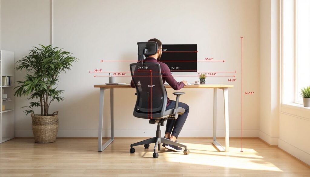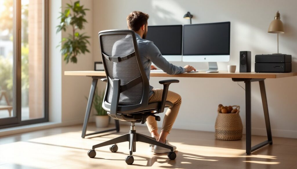

A fresh coat of paint is one of the cheapest ways to transform a home office, and the color you choose matters more than you’d think. Blue has proven itself as the go-to office paint color for good reason, it’s calming without being boring, professional without feeling sterile, and it works in virtually any workspace setup. Whether you’re painting a converted bedroom corner or a dedicated home office suite, selecting the right blue shade can significantly boost focus and reduce the mental fatigue that comes with staring at uninspiring walls all day. Let’s walk through your options.
Table of Contents
ToggleKey Takeaways
- Blue office paint colors promote calm focus and reduce stress hormones, leading to better productivity and fewer afternoon headaches during an eight-hour workday.
- Light blue shades with an LRV (Light Reflectance Value) of 60 or higher work best in small offices and bright spaces, while deep blues (LRV 20–40) require rooms larger than 100 square feet and adequate lighting to avoid feeling cramped.
- Navy blue accent walls are an ideal compromise if you’re hesitant about committing an entire room to deep color—paint one wall behind your desk in navy and pair it with complementary light blue or soft gray on the remaining walls.
- Muted blue tones with gray, green, or taupe undertones offer sophistication and versatility, working in virtually any lighting condition and pairing seamlessly with existing office furniture and decor.
- Always test blue paint colors by applying large samples (at least 2 feet by 3 feet) on your actual walls and observing them at different times of day, as store lighting bears no resemblance to how colors read in your specific room.
- Paint quality, proper prep work, and a satin or semi-gloss finish are critical for office walls—use quality latex paint, fill holes, remove dust, apply painter’s tape, and apply two thin coats for a professional, long-lasting result.
Why Blue Is the Ideal Office Paint Color
Blue hits a sweet spot that few other colors can match for workspace environments. Unlike warm yellows or energetic reds that can trigger mental stimulation, blue promotes calm focus and reduces anxiety, qualities you desperately want during an eight-hour workday. Studies consistently show that blue environments improve concentration and lower stress hormones, which translates to better productivity and fewer headaches by 3 p.m.
From a practical standpoint, blue also works with virtually any office furniture and decor. Whether you’re pairing it with natural wood desks, gray filing cabinets, or white shelving, blue serves as a neutral backdrop that doesn’t compete for attention. It’s why you see blue in corporate boardrooms, law offices, and therapist’s offices, professionals have learned that the color gets out of the way and lets work happen.
The key is matching the right shade of blue to your space’s specific needs. A cramped home office needs different blue than a sprawling bonus room. Lighting conditions, wall square footage, and your own color preferences all influence which blue will actually work in practice, not just in theory.
Light Blue Shades for Small and Bright Offices
Light blues are your friend in smaller offices or rooms that get good natural light. These shades open up the space visually and bounce light around the room rather than absorbing it, which prevents a small office from feeling claustrophobic. Light blues also work well if your workspace gets strong afternoon sun, they won’t heat up the room the way darker colors do.
When shopping for paint, you’ll see light blues labeled as “sky blue,” “powder blue,” “morning sky,” or similar names. In practical terms, you’re looking for blues with high white content, typically paint with an LRV (Light Reflectance Value) of 60 or higher. This number tells you how much light the color reflects: the higher the number, the lighter and more reflective the paint.
A few specifics: if your office gets direct afternoon sun through west-facing windows, aim for a soft blue with a touch of gray undertone rather than pure white-mixed blue. That gray softens the reflected light and prevents the space from feeling too washed out. Test your color choice by painting a large sample (at least 2 feet by 3 feet) on the actual wall and observing it at different times of day. Interior designers at House Beautiful consistently recommend this step because artificial store lighting bears no resemblance to how the color actually reads in your specific room.
Sky Blue and Pale Blue Variants
Sky blue shades, think “clear day at noon” rather than stormy afternoon, work especially well in offices with high ceilings. These colors make the space feel airy and maintain that calm-but-not-sedating quality that makes blue so valuable for work environments. Pale blue variants sit slightly different: they’re closer to lavender-blue and introduce subtle cool undertones that some people find more sophisticated than pure sky blue.
Pale blues with cool undertones are excellent if your office furniture leans modern or minimalist. They pair beautifully with stainless steel desk lamps, glass shelving, and contemporary art. But, if your office has warmer wood tones (oak desks, pine shelving), test a sky blue with warmer undertones first, it’ll feel more cohesive than a cool pale blue that fights against the warmth of the wood.
Deep Blue Options for Professional Home Offices
If your home office is a dedicated room with good electric lighting and you want a more sophisticated, “grown-up” aesthetic, deep blues deliver impact without the darkness. These are the colors used in high-end law offices and executive suites, they convey competence and seriousness. Deep blues work particularly well if you conduct video calls or need to project professionalism to clients who visit your home office space.
Deep blue shades sit in the LRV range of 20–40, meaning they absorb more light than light blues but don’t disappear into blackness. They do require adequate artificial lighting to avoid feeling dungeon-like, especially during winter months when daylight is scarce. If you’re painting a deep blue, budget for accent lighting, a good desk lamp and perhaps one wall sconce will prevent the room from feeling gloomy by 5 p.m. when the natural light fades.
One critical point: deep blues work best on rooms larger than 100 square feet. Smaller spaces painted in deep blue can feel confining. If you’re working with a compact home office, stick with light or medium blues unless you’re painting only one accent wall.
Navy and Dark Blue Accent Walls
Navy blue, essentially a true deep blue without purple undertones, is the workhorse of office painting. It’s formal without being cold, and it provides enough contrast that it reads well on camera during video calls. If you’re hesitant about committing an entire room to deep blue, paint one accent wall (usually the wall behind your desk or the one most visible on video) in navy and the remaining three walls in a complementary light blue or soft gray.
Accent wall painting is straightforward: prep the wall you’re painting just like you would any full room, apply primer if switching to a significantly darker color, and use two coats of quality office paint. Use painter’s tape along the ceiling, floor, and where the accent wall meets adjacent walls to get crisp edges. The tape prevents bleed-through and gives a professional finish that separates your DIY work from amateur-looking jobs. Resources like Houzz showcase office design inspiration that shows how navy accents anchor professional spaces without overwhelming them.
Cool and Muted Blue Tones
Muted blue tones, blues with gray, green, or taupe mixed in, are having a strong moment in 2026 interior design because they feel sophisticated and less “primary color” than pure blues. These are ideal if you find standard blues either too bright or too cold for your taste. Muted blues work in virtually any light condition and pair with a wider range of furniture styles than their pure-blue cousins.
Gray-blue hybrids (sometimes called “slate blue” or “dusty blue”) are particularly versatile in home offices. They read as professional without the coolness that can make pure blues feel impersonal. Muted blue-greens (colors with names like “sea mist” or “eucalyptus”) introduce warmth while maintaining blue’s focus-promoting properties. Green has its own calming, concentration-boosting qualities, so these hybrids give you the best of both worlds.
When testing muted blues, remember that gray undertones can look flat under poor lighting. If your office relies heavily on artificial light, view your paint samples under both the lighting conditions you’ll actually use. A muted blue that looks warm and inviting under your desk lamp might look washed out under harsh overhead fluorescents. Conversely, a sample that looks good in daylight might feel cold once the sun sets.
Muted tones also work beautifully if you’re not starting with a blank canvas. If your office has existing furniture, art, or decor that doesn’t coordinate perfectly with pure blue, muted blue tones are forgiving: they blend rather than contrast. Inspiration galleries on Home Bunch demonstrate how these tones create cohesive, layered office spaces where the paint color supports rather than dominates the design.
Preparation and Application Tips for Office Walls
Paint quality matters significantly in an office space where you’ll spend forty hours a week staring at those walls. Use quality latex or acrylic paint, brands vary by region and budget, but don’t buy the cheapest option on the shelf. Better paint covers more evenly, requires fewer coats, and resists staining and scuffing better than budget paint. For offices, aim for a satin or semi-gloss finish rather than flat or matte: these finishes are more wipeable and maintain a fresher appearance longer as dust and grime accumulate.
Prep work makes or breaks a paint job. Fill any holes or dings with spackling compound, sand smooth once dry, and wipe down all walls with a damp cloth to remove dust and cobwebs. Don’t skip this step, dust prevents paint adhesion and creates a rough, unprofessional-looking finish. If you’re painting over existing color, assess whether a primer is necessary. Generally, if you’re going from light to light, a primer isn’t essential, but if you’re painting over dark colors or stained walls, primer is non-negotiable.
Use painter’s tape along the ceiling line, trim, and baseboards. Quality tape (it costs a few dollars more) prevents bleed-through and peels cleanly without damaging existing paint or trim. Apply it to clean, dry surfaces for best adhesion. Lay plastic sheeting or drop cloths on the floor to protect against drips and spills.
Apply paint with a quality brush or roller, cheap brushes shed bristles into your paint, and cheap rollers leave lint behind. For walls, use a 3/8-inch nap roller for smooth walls or a 1/2-inch nap for textured walls. For trim and edges, use a 2-inch angled brush. Apply two thin coats rather than one thick coat: this creates a more even, professional-looking finish and prevents drips. Allow paint to cure fully (typically 24–48 hours, depending on the brand) before moving furniture back or hanging pictures. Paint continues hardening after it looks dry to the touch, and premature use can result in dings and marks.
If you’re tackling multiple rooms or a large office, consider renting a paint sprayer. For spaces larger than 300 square feet, spraying saves time and often produces a more uniform finish than rolling, though it requires more setup and cleanup. For standard-sized home offices, a roller and brush combination is faster and cleaner overall.